- Lansweeper Community
- Forums
- Reports & Analytics
- Chart: Events last 14 days
- Subscribe to RSS Feed
- Mark Topic as New
- Mark Topic as Read
- Float this Topic for Current User
- Bookmark
- Subscribe
- Mute
- Printer Friendly Page
- Mark as New
- Bookmark
- Subscribe
- Mute
- Subscribe to RSS Feed
- Permalink
- Report Inappropriate Content
01-30-2024 09:04 AM
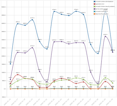
LS has one powerful chart. It is line-diagram. It can show more than 2 column data.
I have developed SQL-query to track most generated events.
Firstly, I have selected sourcenames of events. Then create report.
You should use report's name with prefix "Chart:".
Chart: Events last 14 days
Query:
Select Top 1000000 Convert(nVARCHAR(10),tblNtlog.TimeGenerated,102) thedate,
  Sum(Case
    When tblNtlogSource.Sourcename = 'microsoft-windows-distributedcom' Then 1
    Else 0
  End) [microsoft-windows-distributedcom],
  Sum(Case
    When tblNtlogSource.Sourcename = 'application error' Then 1
    Else 0
  End) [application error],
  Sum(Case
    When tblNtlogSource.Sourcename = 'Microsoft-Windows-Security-Kerberos' Then
      1
    Else 0
  End) [Microsoft-Windows-Security-Kerberos],
  Sum(Case
    When tblNtlogSource.Sourcename = 'service control manager' Then 1
    Else 0
  End) [service control manager],
  Sum(Case
    When tblNtlogSource.Sourcename = 'microsoft-windows-wmi' Then 1
    Else 0
  End) [microsoft-windows-wmi],
  Sum(Case
    When tblNtlogSource.Sourcename = 'Real-time file protection' Then 1
    Else 0
  End) [Real-time file protection]
From tblNtlog
  Inner Join tblNtlogSource On tblNtlogSource.SourcenameID =
      tblNtlog.SourcenameID
Where tblNtlog.TimeGenerated > GetDate() - 14 And tblNtlog.TimeGenerated <
  GetDate() + 1 And tblNtlog.Eventtype = 1
Group By Convert(nVARCHAR(10),tblNtlog.TimeGenerated,102)
Order By thedate
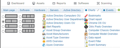
After create report you can add Chart Report on Tab via drag&drop it
Choose line-type and show label. My result (six lines on same chart):
- Labels:
-
Finished Reports
- Mark as New
- Bookmark
- Subscribe
- Mute
- Subscribe to RSS Feed
- Permalink
- Report Inappropriate Content
01-30-2024 09:18 AM
Hello there!
Another nice one! 😎
Reports & Analytics
Ask about reports you're interested in and share reports you've created. Subscribe to receive daily updates of reports shared in the Community.
New to Lansweeper?
Try Lansweeper For Free
Experience Lansweeper with your own data. Sign up now for a 14-day free trial.
Try Now- Report each machines total number of events in last seven days in Reports & Analytics
- Inside Lansweeper: Weekly Recap in General Discussions
- Getting wrong results from >> tblNtlog.TimeGenerated > GetDate() - 1 in Reports & Analytics
- Report Request: Event Viewer Sources in Reports & Analytics


