- Lansweeper Community
- Forums
- Product Discussions
- New menus difficult to work with
- Subscribe to RSS Feed
- Mark Topic as New
- Mark Topic as Read
- Float this Topic for Current User
- Bookmark
- Subscribe
- Mute
- Printer Friendly Page
- Mark as New
- Bookmark
- Subscribe
- Mute
- Subscribe to RSS Feed
- Permalink
- Report Inappropriate Content
05-19-2023 02:55 PM - last edited on 04-02-2024 12:38 PM by Mercedes_O
Lansweeper forced the new menu look and feel in the most recent upgrade, but it is very difficult to work with for me. Hovering over a menu to get a fly-out menu only works intermittently and trying to select from the secondary fly-out menu (especially reports and assets) results in the menu closing more often than not.
I am definitely not a fan of the changes.
- Labels:
-
Product Feedback
- Mark as New
- Bookmark
- Subscribe
- Mute
- Subscribe to RSS Feed
- Permalink
- Report Inappropriate Content
01-19-2024 08:30 AM
Yes there is issues on flyout menus and still waiting for an update to solve this
They are partly visible and this issue pops up everywhere, not just on tickets pages
And the year is now 2024 still no dark mode 😄
- Mark as New
- Bookmark
- Subscribe
- Mute
- Subscribe to RSS Feed
- Permalink
- Report Inappropriate Content
11-07-2023 01:25 PM
Hi!
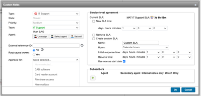
Using the drop-down menus in the "Edit ticket" window is bugged aswell.
When I have let's say a Category sub-menu where there's listed several ticket categories then the drop-down menu extends too much so I need to scroll the whole "Edit ticket" window in order to see the items in the "Category" drop-down menu.
- Mark as New
- Bookmark
- Subscribe
- Mute
- Subscribe to RSS Feed
- Permalink
- Report Inappropriate Content
10-03-2023 09:05 AM
I´m also struggling with the new menu. Usually it takes about 3 attempts until the search for the right report and select it, is successful.
The fly-out should be more "sticky", and don´t close until you point to another fly-out-menu or klick outside.
- Mark as New
- Bookmark
- Subscribe
- Mute
- Subscribe to RSS Feed
- Permalink
- Report Inappropriate Content
06-06-2023 06:15 AM - edited 10-04-2023 01:24 PM
New Layout loses filter during mouse move out of over current menu item
- Mark as New
- Bookmark
- Subscribe
- Mute
- Subscribe to RSS Feed
- Permalink
- Report Inappropriate Content
05-31-2023 07:25 AM
+1
Could you back selection of old design and made themes switch?
- Mark as New
- Bookmark
- Subscribe
- Mute
- Subscribe to RSS Feed
- Permalink
- Report Inappropriate Content
06-05-2023 01:51 PM
Unfortunately, this will not be possible, but we are open to suggestions on improving the current view. Can you share your feedback?
- Mark as New
- Bookmark
- Subscribe
- Mute
- Subscribe to RSS Feed
- Permalink
- Report Inappropriate Content
05-24-2023 05:41 PM
Hi @MarkPayton
Thank you for the feedback! Could you give us more details about the issues you are experiencing?
- Mark as New
- Bookmark
- Subscribe
- Mute
- Subscribe to RSS Feed
- Permalink
- Report Inappropriate Content
05-22-2023 03:25 PM
Hello there!
Thank you for your feedback. We will make sure that our product team is aware of this.
Product Discussions
Share feedback, exchange ideas and find answers to Lansweeper product questions.
New to Lansweeper?
Try Lansweeper For Free
Experience Lansweeper with your own data. Sign up now for a 14-day free trial.
Try Now- Do we need to install LsAgent on laptops? in Technical Support Solutions
- How to Invite Lansweeper Support to Your Cloud Site in Technical Support Solutions
- Associate last user to asset from asset options menu in Product Discussions
- Menus/icons to lowercase in General Discussions
- IP Scanning versus IP Locations Report in Reports & Analytics


