- Lansweeper Community
- Forums
- Reports & Analytics
- Chart: Status of AD users
- Subscribe to RSS Feed
- Mark Topic as New
- Mark Topic as Read
- Float this Topic for Current User
- Bookmark
- Subscribe
- Mute
- Printer Friendly Page
- Mark as New
- Bookmark
- Subscribe
- Mute
- Subscribe to RSS Feed
- Permalink
- Report Inappropriate Content
02-29-2024 10:26 AM - edited 02-29-2024 10:31 AM
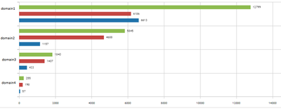
LS has a powerful chart. It is Bar-diagram. It can show more than 2 column data.
I have developed SQL-query for AD Users. It have to be used with this type chart.
You should use report's name with prefix "Chart:".
Chart: Status of AD users
Query:
Select Top 1000000 tblADusers.Userdomain,
  Sum(Case
    When tblADusers.IsEnabled = 'false' Then 1
    Else 0
  End) Disabled,
  Sum(Case
    When tblADusers.IsEnabled = 'true' Then 1
    Else 0
  End) Enabled,
  Count(tblADusers.Username) All
From tblADusers
Group By tblADusers.Userdomain
Order By All Desc
At first, you have to enable checker to scan Disabled Users:
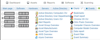
After creation of the report you can add Chart Report on Tab via drag&drop it
Choose Bar-type and show label. My result:
- Labels:
-
Finished Reports
-
Report Center
- Mark as New
- Bookmark
- Subscribe
- Mute
- Subscribe to RSS Feed
- Permalink
- Report Inappropriate Content
03-01-2024 03:28 PM
Awesome job! Keep sharing these!
Reports & Analytics
Ask about reports you're interested in and share reports you've created. Subscribe to receive daily updates of reports shared in the Community.
New to Lansweeper?
Try Lansweeper For Free
Experience Lansweeper with your own data. Sign up now for a 14-day free trial.
Try Now- SSO Domain Verification Fails in Lansweeper Cloud in Technical Support Solutions
- 🎉 Celebrating the Winners of the Lansweeper Excellence Awards 2024! in General Discussions
- Report schedules in Sites keep pausing in General Discussions
- Patch Status Chart Problem in Reports & Analytics
- Unlock the Future of Device Management with Devicie Endpoint Health dashboard! in General Discussions


